La gran mentira

The Big Lie of Science is that it doesn’t matter who does the science, as long as the research is sound. The truth is that scientists judge each other’s work through their own prejudices, and the Lie lets them get away with it. The Lie lets people remain silent when they see their colleagues being mistreated, because “personality shouldn’t matter”. The Lie absolves us of responsibility to do anything about discrimination and hostile environments for anyone who doesn’t neatly fit the mold created for white, straight, cisgendered men and those they approve of.

Origen: The Big Lie of science | Galileo’s Pendulum

Continuar leyendoLa gran mentira

El catálogo de Duchamp

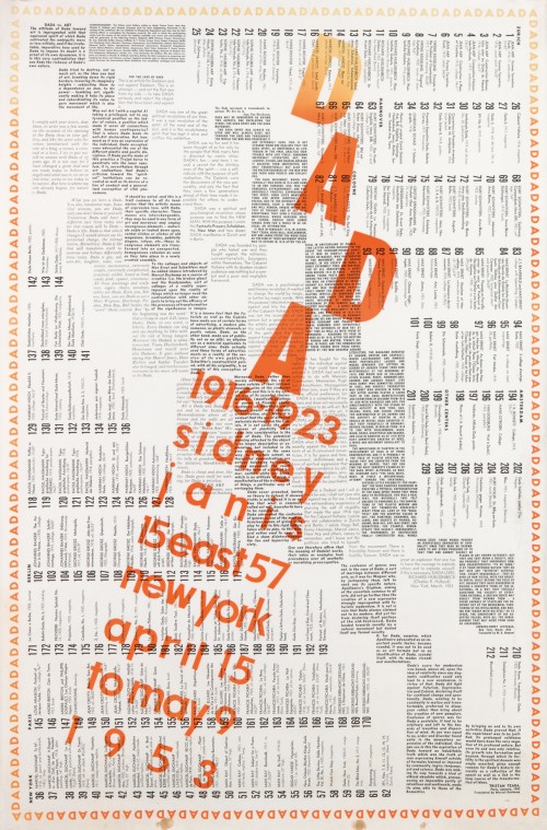
Catálogo diseñado por Duchamp para una exposición Dada. La gracia es que se suponía que el catálogo debía entregarse arrugado, formando una bola de papel:

M31427-2 001

The Dada catalogue has all 212 works listed from the exhibition at Sidney Janis Gallery in New York, including 12 by Duchamp alongside those by Max Ernst, Kurt Schwitters, Jean Arp, Man Ray, and others organized by country. Staggered alongside are four concise essays by Hans Arp, Richard Huelsenbeck, Jacques-Henry Lévesque, and Tristan Tzara, with the name of the exhibition in semi-bold, reddish orange over the black letterpress text. The layout readily recalls the kinetic feel of Duchamp’s “Nude Descending a Staircase, No. 2″ (1912), but it has as much in common with his readymades that took an object and repositioned it as art (most famously with the “Fountain” urinal, one of which was replicated in the Janis show). As Caroll Janis wrote in Art in America in 2006, when the “painstakingly produced catalogue” was printed, Duchamp reportedly “took a sheet in his hands, crushed it into a loose ball, and suggested that a trash can full of these paper balls be offered to visitors entering the vernissage” (which, as usual, he didn’t attend). The Philadelphia Museum of Art has one of these crumpled versions in its collections, with the catalogue going from printed poster, to trash, to art just by the action and context.

Origen: The Dada Catalogue Marcel Duchamp Designed to Be Thrown Away

Continuar leyendoEl catálogo de Duchamp

Mahler para Spectrum

Fascinante. La primera sinfonía de Mahler en un conjunto de ordenadores ZX Spectrum conectados en red. Siguiendo la divertida propuesta del manual original.

Muchos recordarán el Spectrum como su primer ordenador (el mío fue el ZX81. Más antiguo todavía). Por lo visto, queda todavía toda una comunidad de entusiastas de esa máquina.

(ht Xavier Riesco)

Continuar leyendoMahler para Spectrum

¿BoJack y los grandes datos?

Me gusta mucho esta reflexión sobre BoJack Horseman, esa excelente serie de animación de Netflix. El argumento principal es que una serie así no debería existir, que mezcla demasiados géneros, que cambia excesivamente de registro en unos pocos minutos como para poder recibir la aprobación de una cadena normal de televisión. Sin embargo, Netflix dispone de enormes datos muy precisos sobre lo que la gente ve o deja de ver. La hipótesis es que una empresa como Netflix podía “ver” que el uso de elementos tan diversos mezclados podía trascender las divisiones demográficas habituales y satisfacer a un grupo “desconocido” hasta ese momento.

Neighed to Order: The Case of BoJack Horseman Matt Sienkiewicz / Boston College | Flow:

Our suggestion, therefore, is that at the moment of the show’s pitch and throughout the development process, Netflix may well have had reason to believe that BoJack’s strange menagerie could actually work. Armed with data about the viewing habits of its clients, the company was able to free itself from the restraints of long standing industry lore and even the limitations of blunt instruments such as genre conventions and traditional demographics. In a previous era, BoJack may well have been seen as a program full of contradictory niches, hailing small audience groups with one aspect while repelling those same groups with the next. The data, however, may well have shown that this would not be the case, suggesting that audiences for the shows BoJack draws from have more in common than is immediately apparent.
Certainly, there is the potential for the abuse of such information. If BoJack works too well, we could see a parade of increasingly ham-fisted attempts to combine popular programs in cheap, search engine-friendly ways. Though this may be unfortunate, it would also not be terribly new, of course, as copy catting has long been one of the industry’s most unappealing but profitable vices.

Es, simplemente, una hipótesis, que se fundamenta en saber que Netflix dispone efectivamente de esos datos. Evidentemente, ya se apunta en el segundo párrafo que si es así, podemos acabar con un montón de programas creados según los datos.

Pero:

In the meantime, we can enjoy the freedom that BoJack displays in its mixing of genres and crossing of references. It is a strange, wondrous beast of a show, recalling Raoul Duke’s description of Dr. Gonzo in Fear and Loathing in Las Vegas: “too weird to live, too rare to die.” In a previous era, it likely would not have lived at all. Today, it exists and even thrives, perhaps less to the surprise of its benefactors than we might think.
Continuar leyendo¿BoJack y los grandes datos?

Late Rembrandt

Late Rembrandt es una exposición (hasta el 17 de mayo) en el Rijksmuseum de Ámsterdam:

Rembrandt’s later life was marked by tragic personal loss and financial setbacks. Yet it was also the time when he produced his best work. He experimented with paint and light, managing to bring an unprecedented emotional depth to his work. It resulted in his most daring and intimate work.

En A Generosity of Rembrandts: The Late Works at the Rijksmuseum la comentan:

The exhibition begins with a series of late self-portraits, a somber how-do-you-do in the foyer of the show. These establish what Rembrandt’s numerical age might not (he was 63 when he died): that he was playing an endgame. All half-lengths, the self-portraits depict the body in a three-quarters view, the head turned to the picture plane. In each, his face is wrinkled and pouchy, and in the 1659 self-portrait now in Washington, D.C., he seems to have taken great care to use all the crusty bits of paint on his palette to render the weathered and spotty texture of his skin in strokes of jaundice yellow and rosacea pink.

Rembrandt had reason to feel the weight of mortality and loss. He had once dominated the Amsterdam art world. His portraits were in demand by the city’s elite, he made a love match with his dealer’s higher-born niece, Saskia, and he could afford to buy a large new house in a nice part of town. By 1656, all that was over. Saskia had died after a series of difficult pregnancies; he’d had a disastrous love affair with the woman he’d hired to take care of his surviving child; and unwise spending, much of it on art and things like exotic shells, led to bankruptcy. He lived in reduced circumstances with his second love, Hendrickje, and his son Titus, but he survived them both, Hendrickje by six years, Titus by one.

Continuar leyendoLate Rembrandt

No molestar

Se puede coleccionar cualquier cosa, incluso esos cartelitos de «no molestar» que hay en los hoteles. Y resulta que la variación puede ser espectacular.

As the son of a hotel manager, Edoardo Flores spent his childhood around objects many of us associate solely with the niceties of vacation. His interest in collecting “Do Not Disturb” signs didn’t come until later, when he grabbed some unique ones as business trip souvenirs. Around 1995 he began collecting in earnest, and he now owns close to 9,000 signs from 190 countries.

In a history of the collection that Flores provided to Hyperallergic, he claims that little is known about the development of the “Do Not Disturb” (DND) sign, now such a common, expected component of hotel stays. Flores speculates that the DND sign was the wise invention of one hotel manager, and that other places later emulated the practice.

Mi preferido creo que es:

Origen: The Diverse Designs of “Do Not Disturb” Signs

Continuar leyendoNo molestar